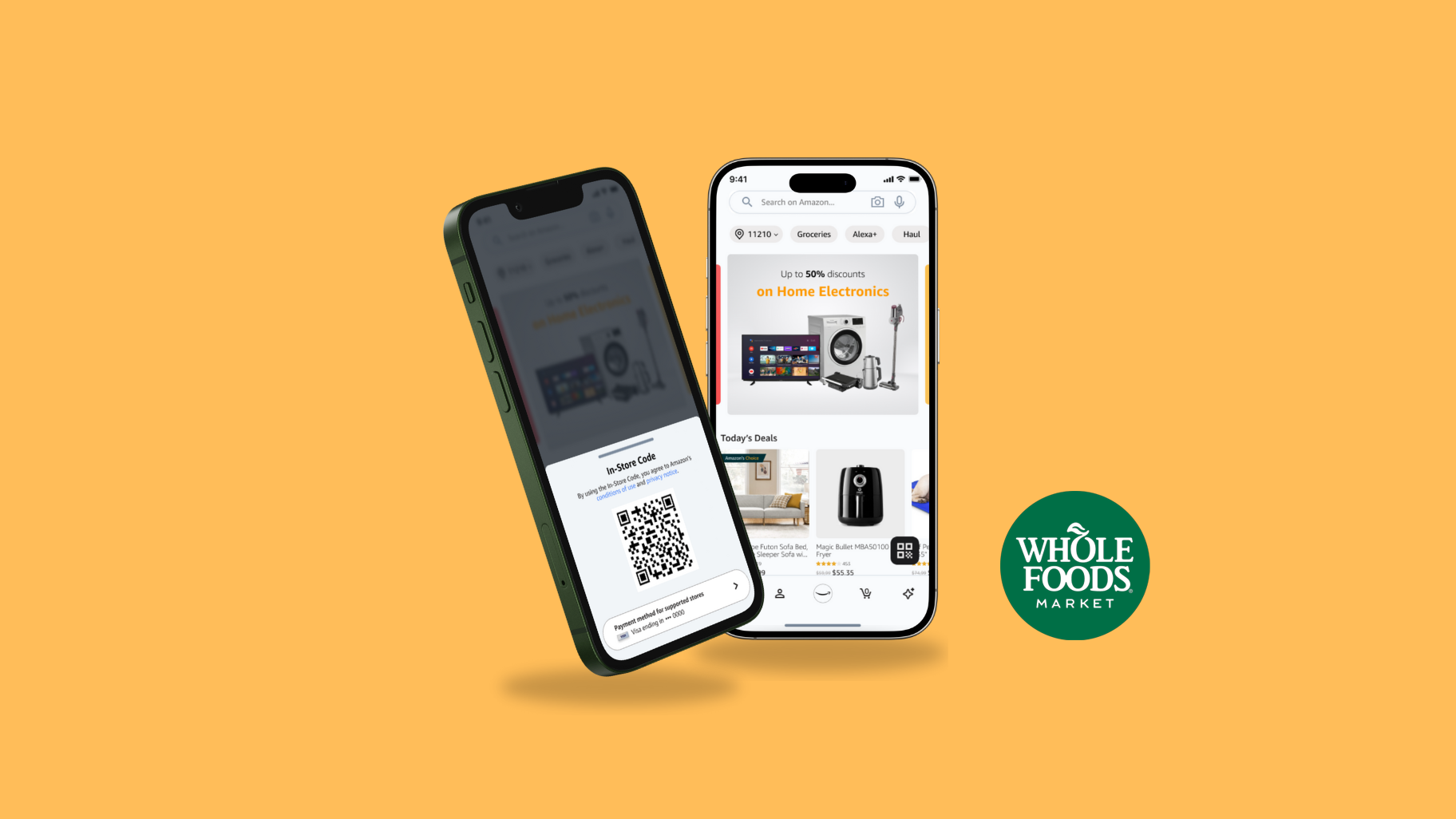
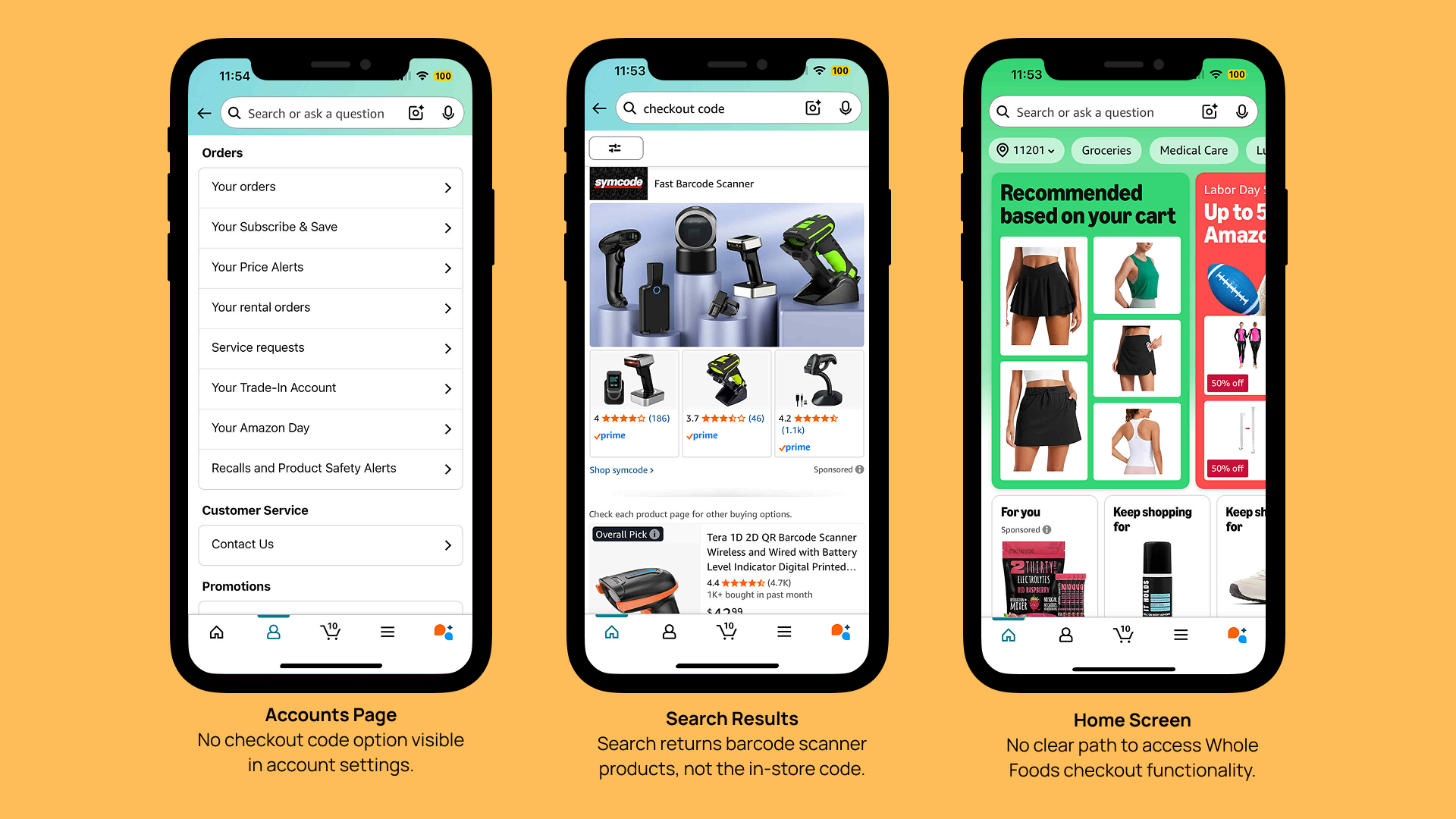
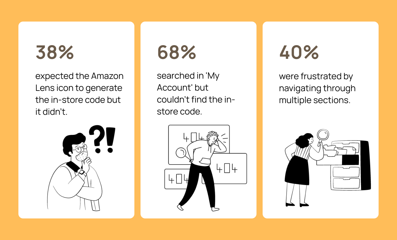
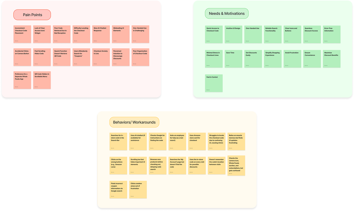
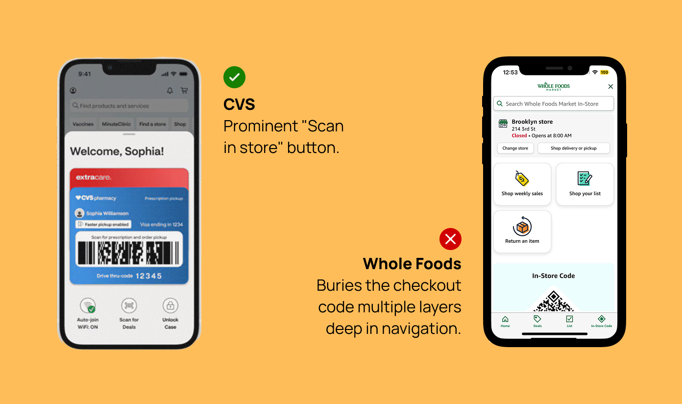
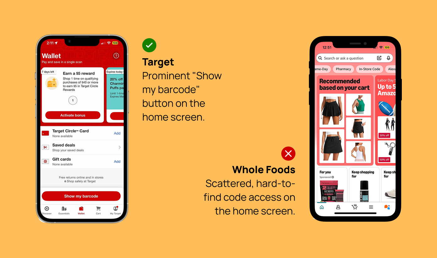
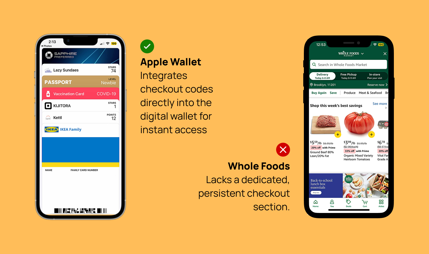
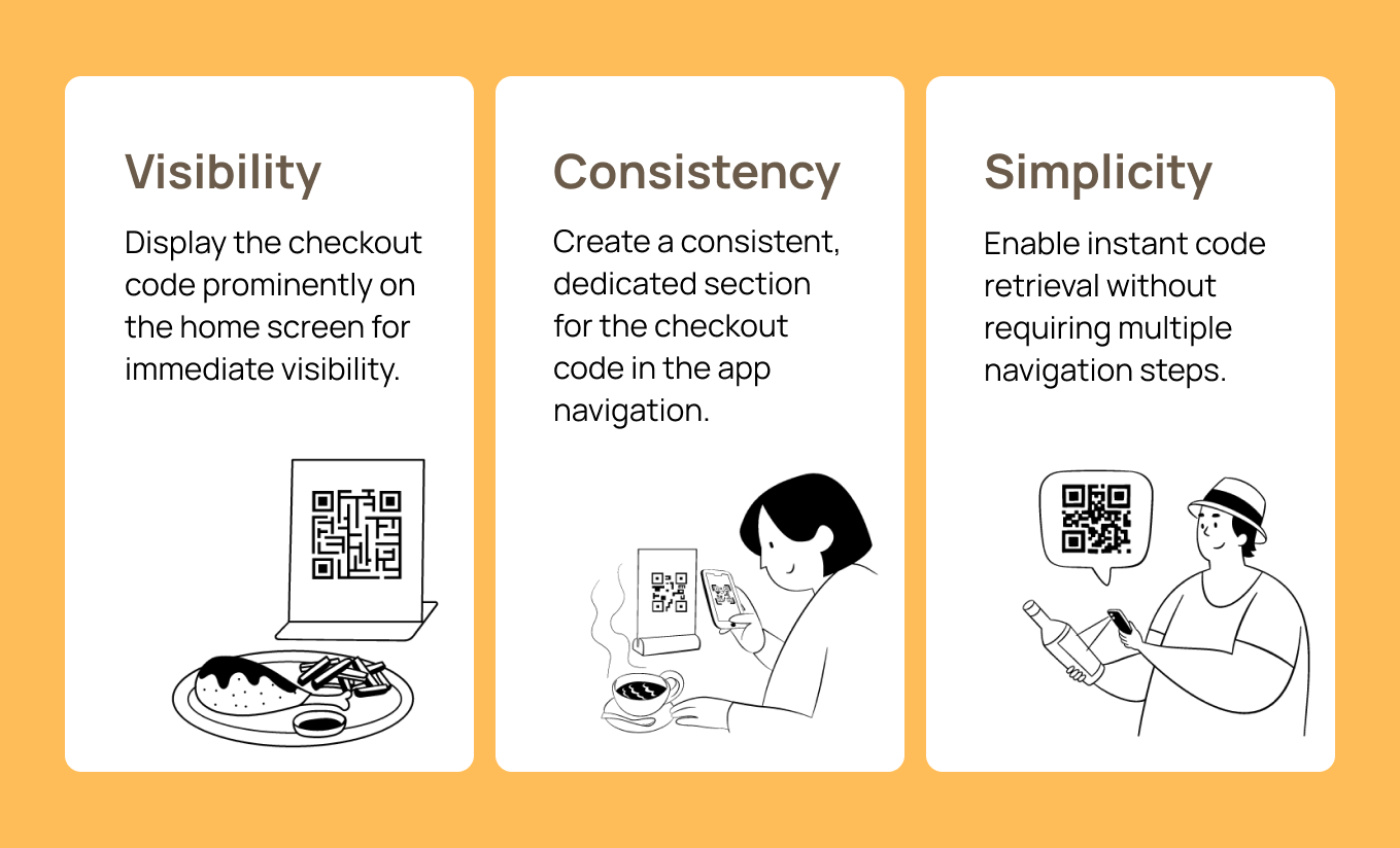
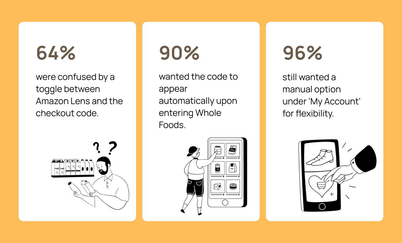
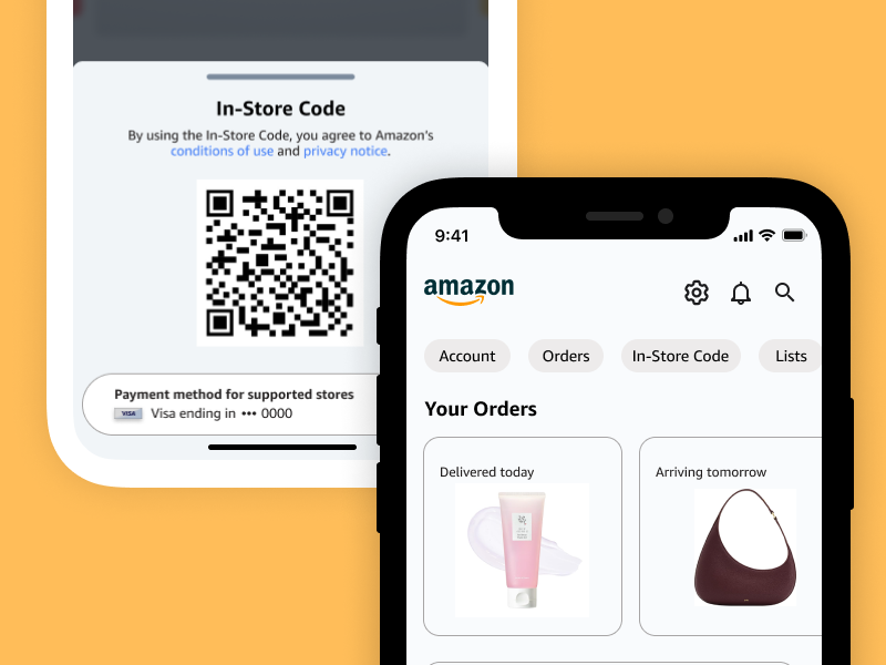
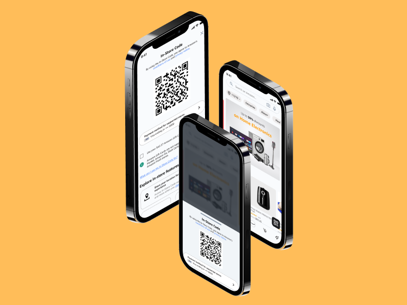
In this project, I redesigned the Amazon app's Whole Foods checkout feature. The project specifically addressed the challenge of streamlining access to the in-store checkout code, aiming to create a faster, frustration-free experience for customers at Whole Foods checkout.
The project focused on solving a specific pain point: customers at Whole Foods struggle to quickly find their in-store checkout code in the Amazon app. The cluttered interface makes it difficult to locate, causing delays at checkout and leading to frustration. To address this, I aimed for the following:
Simplify the process of finding and accessing the in-store checkout code within the Amazon app.
Implement clear, consistent placement of the checkout code feature with intuitive navigation.
Create an interface that reduces friction and speeds up the checkout process.
Eliminate the stress and delays caused by difficulty in locating the checkout code.
Customers at Whole Foods struggle to quickly find their in-store checkout code in the Amazon app. The cluttered interface makes it difficult to locate, causing delays at checkout and leading to frustration.
How might we make the in-store checkout code easier to find within the Amazon app?
My hypothesis suggests that by implementing a persistent checkout code feature with intuitive navigation, we can reduce the time and effort required for customers to access their code.
Making in-store checkout codes instantly accessible through persistent visibility and intuitive placement.
The redesigned Amazon app brings the in-store checkout code to the forefront through a persistent button and clear visual hierarchy. By prioritizing quick access and reducing navigation steps, we transform the checkout process in Whole Foods from a frustrating hunt into a seamless part of the shopping experience.
WHEN WAS THIS?
Jan - Mar 2025 (7 Weeks)
WHAT DID I DO?
User Researcher | UX/UI Designer | Product Designer
To better understand user frustrations, I conducted 6 interviews and 2 rounds of usability tests. Here's what I found:
38%
expected the Amazon Lens icon to generate the in-store code but it didn't.
68%
searched in 'My Account' but couldn't find the in-store code.
40%
were frustrated by navigating through multiple sections.
Based on my research, I explored various design solutions including a dedicated QR code button, integration with Amazon Lens, and a consistent feature placement under 'My Account'.
After 2 rounds of user testing with 5 individuals, here's what I found:
Building on user testing insights, I implemented two key changes to improve the checkout experience:
Solution 1: A distinct QR code button appears when users enter a Whole Foods store, providing instant access. The Amazon Lens icon has also been updated to a camera symbol for better user recognition.
This distinct QR code button ensures quick and effortless access for all shoppers — whether they need instant visibility, a seamless one-tap experience, or a clean, accessible design that reduces friction at checkout.
Solution 2: A dedicated 'In-Store Code' option under 'My Account' ensures consistent access to the checkout code.
This in-store checkout code feature in 'My Account' provides easy access for all shoppers — whether they need consistent visibility, quick manual access, or an intuitive and organized experience that enhances accessibility and reduces friction.
Explore the interactive prototype to see the key user flows:
This project marks my first comprehensive end-to-end UX case study, where I tackled improving the Whole Foods in-store checkout experience for customers. Through this journey, I've grown significantly in user-centered design methodologies, from conducting thorough user research to crafting data-driven solutions that enhance the shopping experience.